Generally, there are two main categories of data sources. One is topical — market and competitive data that you acquire via research tools and market research. The other is comprised of all the data in your own business/digital ecosystem, from how consumers interact with your website to which of your ads they engage with (or not). In many cases, this internal data can be augmented by data from other functional areas. Does HR have data about employee roles and training that can inform engagement on retraining programs? Does Public Affairs have data on policy influencers that can inform engagement with them? The more integrated data is across the organization, the more robust and actionable it becomes.
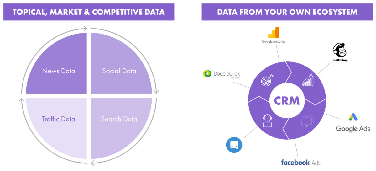
If you’re tackling a new initiative, oftentimes you get the most valuable insights by looking at the topical, market and competitive data before mining the data from your own ecosystem.
News Data is what you probably know best. It’s relevant because what people hear or see on mainstream media often shapes the general context in which a communications initiative is being perceived. If your company has had bad press for a while, your employer branding campaign will perform differently than when coverage was positive. Most organizations habitually monitor media coverage, and many analyze it for tone, sentiment and message delivery.
To perform quick and reliable full-scale topical media analysis, leverage tools like BrandWatch or Meltwater.
If you only look at what journalists focus on, you only see half the story. You also need to know which aspects of a topic engage people the most, people whom you want to move to a desired action.
– What content about the topic do they engage with (like, comment, share)?
– What questions and discussions do they have in forums, blogs and boards like Reddit?
– What postings do they publish around a topic on Twitter, Facebook, etc.?
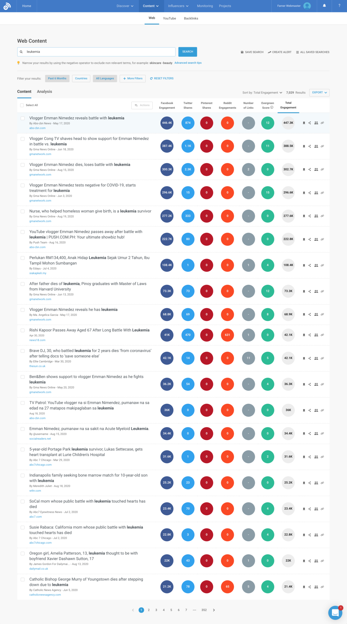
To analyze what content about a topic engages audiences the most, leverage tools like BuzzSumo. Here’s a look at the most engaging stories around leukemia in the last six months:
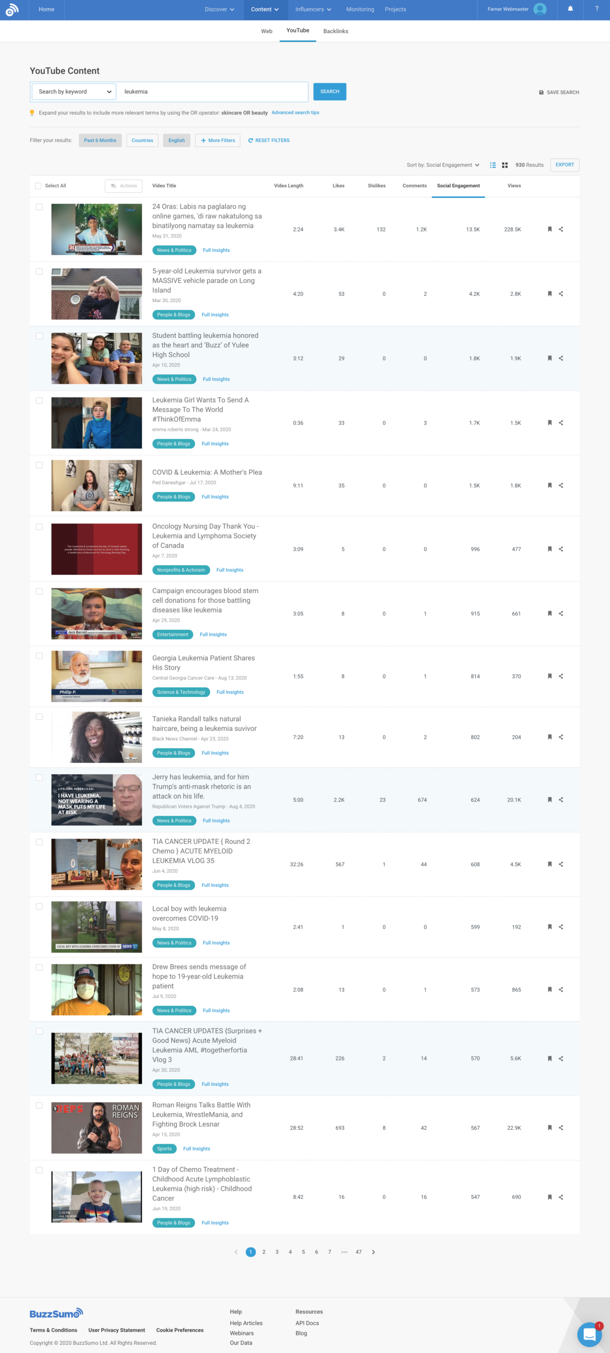
You can also do this specifically for video content – e.g., the most engaging YouTube content for any given topic:
You can also use a tool like Answer the Public to get quick insights into the specific questions on which users search online related to the topic. Here are the results related to leukemia:
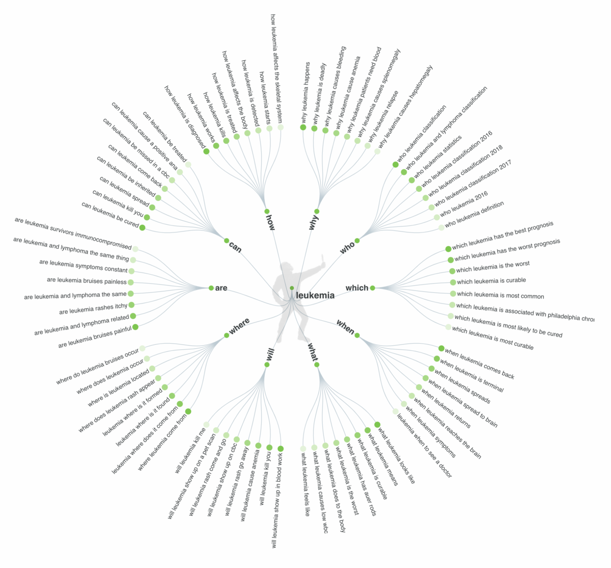
One reason AnswerThePublic.com is so useful and engaging is that the data is not just presented as a list but is visualized in a way that makes sense of it. It clusters hundreds of Google searches into:
1) Questions (why, which, who, where, when, etc.);
2) Comparisons (vs, or, like, etc.); and
3) Prepositions (with, without, for, to, etc.). This grouped view helps you quickly understand the key questions, worries and thoughts consumers face on their decision making journey in a specific topic.
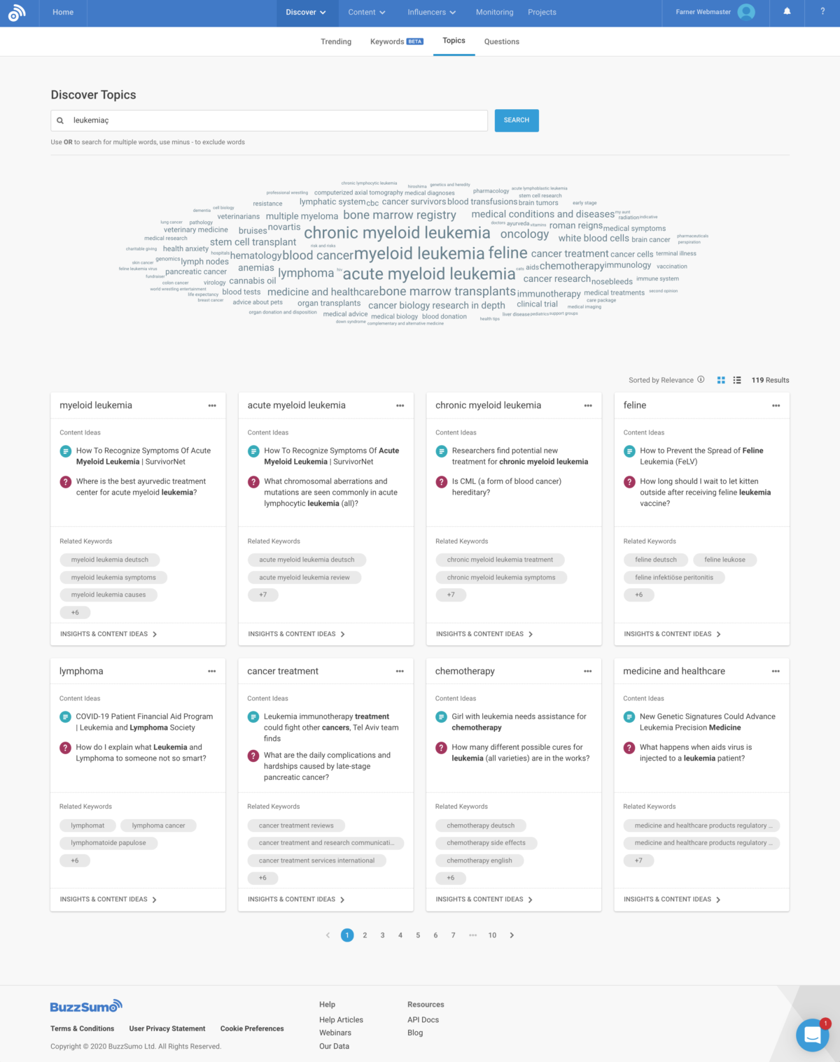
And BuzzSumo has a neat feature that combines the most engaging content with key questions – and clusters the data in “sub-topics”:
When users enter the BELIEF stage in any given topic, they start researching via Google and other search engines. Analyzing what people search for in a topical area provides heaps of insights that can directly translate into content ideas. For many topics, you will find thousands if not millions of search query variations that people research. The key then is to cluster these searches into topically similar searches and try to map these clustered searches on the journey.
To return to the car-buying example from Chapter 1, one may begin research in the BELIEF stage by searching for “crossover SUV” or “minivan,” or perhaps “crossover SUV vs. minivan.” This addresses the initial question, What type of vehicle is right for me? Once that decision is made, one might then search for “best crossover SUV” or “crossover SUV reviews.” With more research done, they may then begin searching vehicle makes and models by name.
For clustering searches into topical categories, many of the best search engine optimization (SEO) tools like SearchMetrics, Semrush and Moz already have machine learning-powered features. They will provide a first clustering proposal. However, most of the time, this clustering is not very accurate or is too general to provide very actionable insights.
For mapping clustered searches on the journey, your knowledge of your topic area and your consumers is blended. There is currently no useful tool on the market that will completely automate this for you.
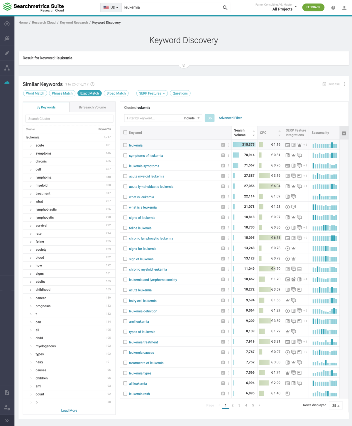
On the below screenshot from SearchMetrics, you see that in the U.S., there are 6,427 search variations that users search for every month. You see that the top keyword “leukemia” is being searched for 286,311 per month (search volume) and that the cost-per-click (CPC) for placing a Google ad on these keywords is €1.19.
On the left side you see the Clustering that SearchMetrics Machine Learning is doing. Within all keywords (6,427):
Searchmetrics also shows you seasonality patterns – some of which may not be obvious. For example, in October, there is a significantly higher level of searches for leukemia than in any other month. However, the official leukemia and child cancer awareness month is not October but September.
The last data category is traffic data. There are many tools that allow you to analyze what websites and players in a market get website traffic, how much traffic, and even more interestingly, from where it comes.
Tools like SimilarWeb allow you to do just that. A panel of consumers opt in to be tracked across the websites and apps they use. These tools are not 100% accurate, but they can give you directional and comparative insights. You see the difference in accuracy when you compare SimilarWeb traffic for your website with your own Google Analytics data. But the purpose of these tools is not to replace your own Google analytics. Instead, it gives you competitive directional insights that you simply cannot get in any other way.
So, what next? Try combining the search data with SimilarWeb data to mirror a “topic market” and see what players get the most traffic. For example, suppose you were to copy and paste the top 200 most searched keywords related to “leukemia” (identified via SearchMetrics) into SimilarWeb. In that case, you could find a useful market share overview for the websites that get the most significant part of the traffic for these searches. Not only do we know what people search for, but we also know what they’ll see after that.
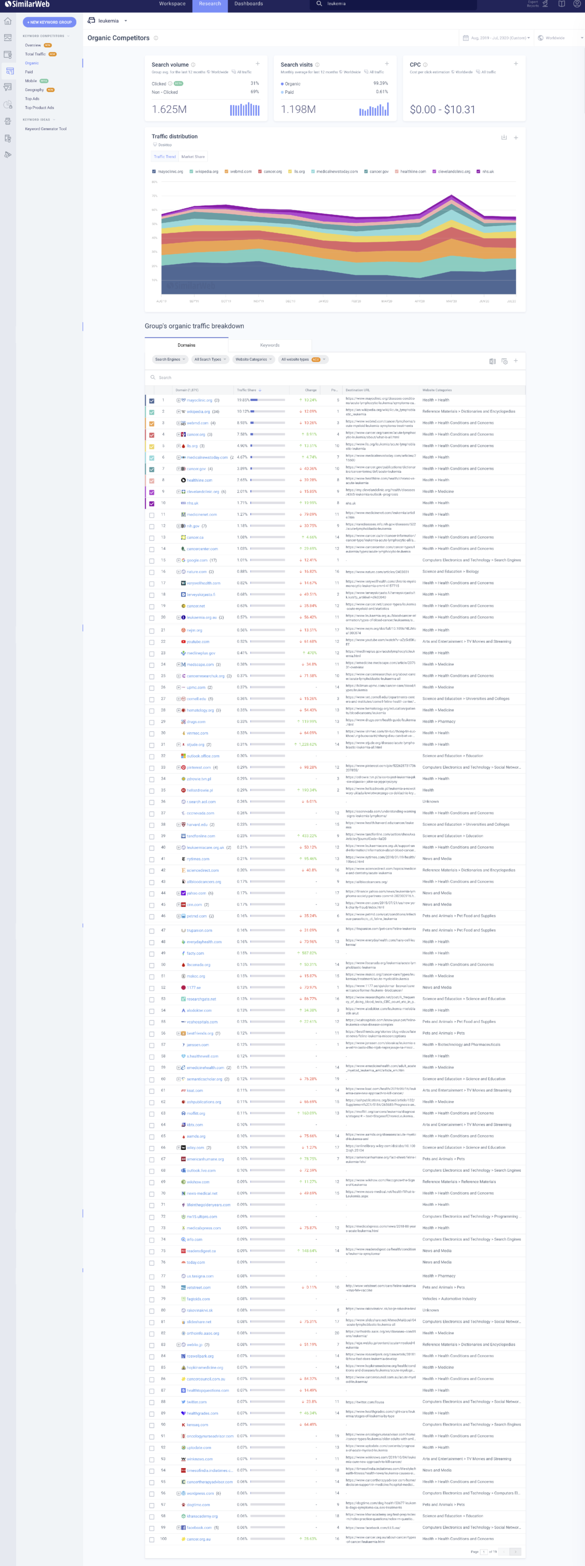
Knowing where consumers will go and what content they will see is a big plus. Based on this, you can develop successful content for your own campaign. And you’ll also gain insight into which brands and/or websites you might target for earned media, advertisements or partnerships.
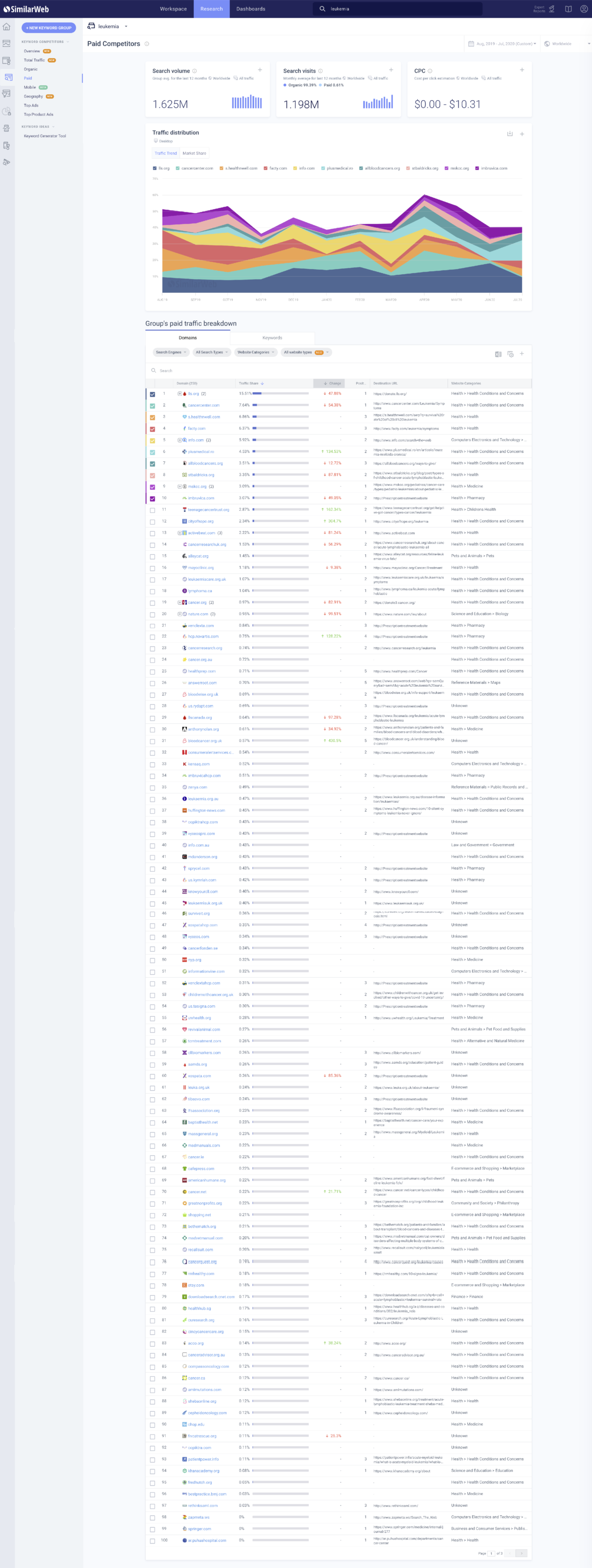
Another interesting option is to look at the same data from a “paid search” perspective. Who is buying Google ads to get a piece of the “leukemia” traffic? This data is key to understanding the competition in your topic space or niche.
Of course, there are other more “traditional” methods, like surveys, to get insights into your audience’s wants, needs, beliefs and behaviors. But note that search and traffic data do not have social desirability bias. In other words, it’s what people actually do, not what they say they think or do. And it’s far less expensive and much faster.